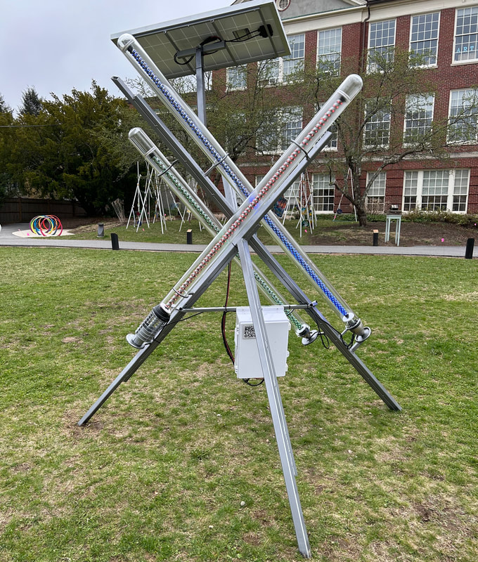
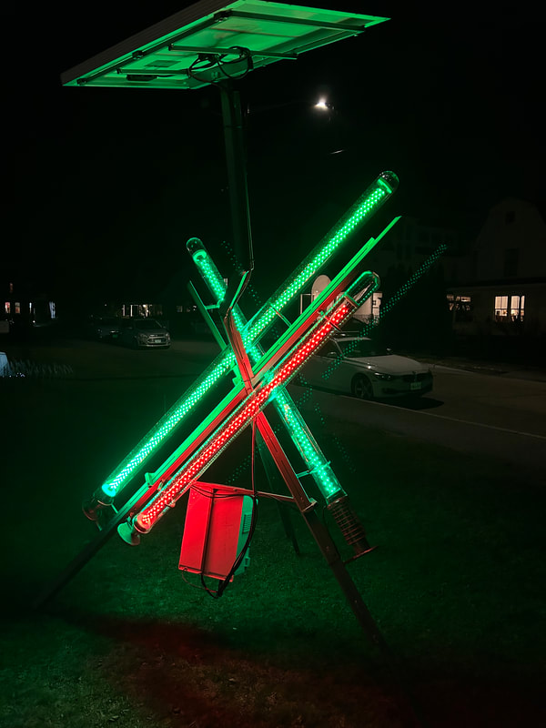
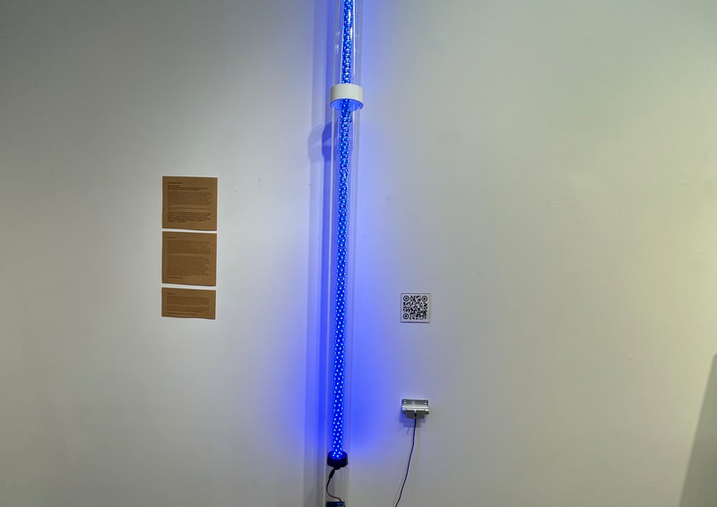
2024, Steel, Glass, led strips, arduino, solar power kit, 6'x7'x10'
Visual artist Victor Pacheco with Environmental Scientist Paul Kirshen
Victor Pacheco and Paul Kirshen focused on Kirshen’s climate adaptation research and collaborated on a project to bring awareness to changes in temperature due to human impact. Temperature Check! is a sculptural instrument that measures the real time temperature in its location and alerts us through a light display if the temperature is above the average, average or below the average temperature.
Collaborators
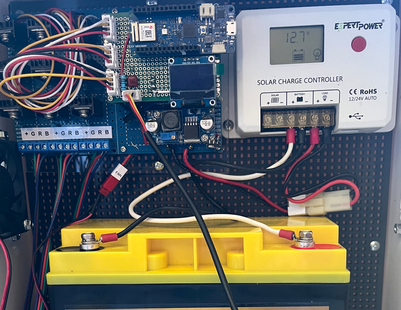
Computer Science professor Kevin Walsh, created the code and circuit for the project. We used several other electronic componants including a temperature sensor, Arduino, solar power kit and LED light strips.
University of Massachusetts Boston, graduate student Vishal Verma did the data analysis of the temperature data.
Ideas and Purpose
The idea with this project is to bring awareness and inform the viewer what the current outdoor temperature is compared to the temperature in the past. Is our current temperature higher than in the past? What happens if the temperature keeps rising? Will eco systems change? How does this affect us(humans)? Will rising temperatures affect our food supply ? What will this change? We are already seeing sea level rise due to ice melting at a faster rate. Is adaptation possible? What can I do ?
Project Goal
The project goal is to compare today’s real-time temperature to the maximum daily temperature of the same week in a past period with less climate change and also with a period in the near-term future with more climate change than now. This will give the viewer a sense of how much the climate has changed and will change in the future with a moderate Greenhouse Gas(GHG) emission scenario.
The more the temperature changes, the more we will also experience increases in annual precipitation and extreme storm precipitation, more floods and droughts, and more sea level rise and increases in coastal flooding. Some of these local climate changes possible over time can be found in Reference 1 below and some of the statewide impacts and management plans in References 2 and 3. Reference 4 is the US National Climate Assessment which also summaries some impacts and adaptation strategies.
How to read the outdoor sculpture
How to read the sculptural instrument
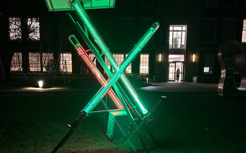
This sculpture serves as an instrument to inform the viewer if the temperature is above, the same or below the average temperature as from a past period in time( 1950-1970 with less climate change).
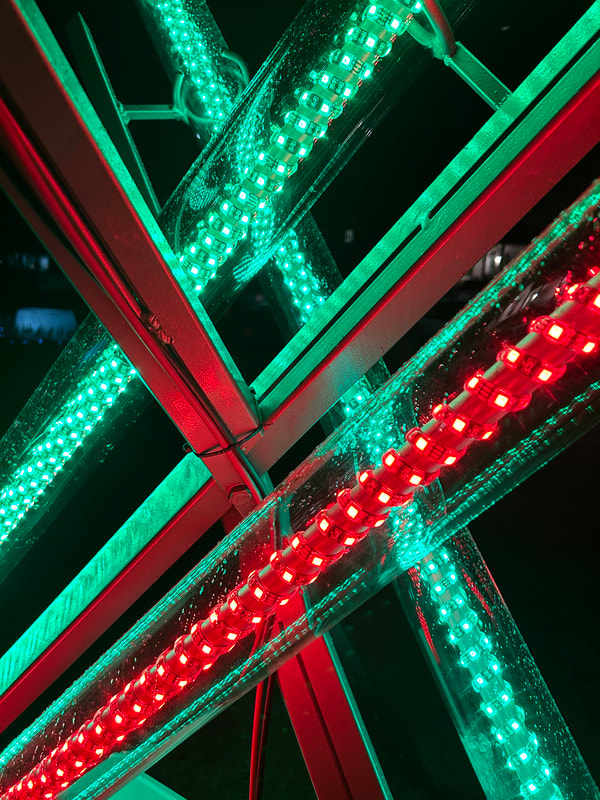
The sculpture outside is composed of 3 glass tubes. The glass tubes are equiped with a series of LED strips .
RED= above average temperature reading
Green= Average temperature reading
Blue= below average temperature reading
See the current temperature, historical temperature max and predicted temperature max in link below, This Data dashboard is from the sculpture live, The sculpture is collecting this information through a temperature sensor probe and utilizing an Arduino chip to signal what color to turn on based on the past historical data.
sites.google.com/d/17rGxWROXhlh-m02t8iQh91jvCY96nX5o/p/19ffL0ZYax0gULn5coY-aA_PtSd0v_sKN/edit
References
1.Climate change impacts and projections
2. Massachusetts Climate Change Assessment | Mass.gov
3. 2023 ResilientMass Plan | Mass.gov
4. Fifth National Climate Assessment (globalchange.gov)
- For more information click on underlined text
Visual artist Victor Pacheco with Environmental Scientist Paul Kirshen
Victor Pacheco and Paul Kirshen focused on Kirshen’s climate adaptation research and collaborated on a project to bring awareness to changes in temperature due to human impact. Temperature Check! is a sculptural instrument that measures the real time temperature in its location and alerts us through a light display if the temperature is above the average, average or below the average temperature.
Collaborators
Computer Science professor Kevin Walsh, created the code and circuit for the project. We used several other electronic componants including a temperature sensor, Arduino, solar power kit and LED light strips.
University of Massachusetts Boston, graduate student Vishal Verma did the data analysis of the temperature data.
Ideas and Purpose
The idea with this project is to bring awareness and inform the viewer what the current outdoor temperature is compared to the temperature in the past. Is our current temperature higher than in the past? What happens if the temperature keeps rising? Will eco systems change? How does this affect us(humans)? Will rising temperatures affect our food supply ? What will this change? We are already seeing sea level rise due to ice melting at a faster rate. Is adaptation possible? What can I do ?
Project Goal
The project goal is to compare today’s real-time temperature to the maximum daily temperature of the same week in a past period with less climate change and also with a period in the near-term future with more climate change than now. This will give the viewer a sense of how much the climate has changed and will change in the future with a moderate Greenhouse Gas(GHG) emission scenario.
The more the temperature changes, the more we will also experience increases in annual precipitation and extreme storm precipitation, more floods and droughts, and more sea level rise and increases in coastal flooding. Some of these local climate changes possible over time can be found in Reference 1 below and some of the statewide impacts and management plans in References 2 and 3. Reference 4 is the US National Climate Assessment which also summaries some impacts and adaptation strategies.
How to read the outdoor sculpture
How to read the sculptural instrument
This sculpture serves as an instrument to inform the viewer if the temperature is above, the same or below the average temperature as from a past period in time( 1950-1970 with less climate change).
The sculpture outside is composed of 3 glass tubes. The glass tubes are equiped with a series of LED strips .
- The longest glass tube measures real live temperature in Fahrenheit degrees. This is compared to the maximum daily temperature in the past for the same week of the year(1950-1970 historical data) when climate change was less (Tube 3 – see description below).
- The 60" tube displays the possible maximum temperature for the same week for 2050 in Concord for a moderate emission scenario of greenhouse gases from Climate Explorer (nemac.org) (this tube will most likely be red most of the time) Temperatures are expected to rise by 4. degrees in the predicted future so the color of this tube is mostly red(above the average temperature whe compare to historical data.
- 60" tube displays the color green for the average maximum daily temperature for the same week in the past when there was less climate change compared to the present – this is the period 1950-1970 using data from the US National Weather Service for Hanscom Field, Bedford MA. We have set this to to be grren to identify it as the an average baseline by which to compare the the live temoerature reading.
RED= above average temperature reading
Green= Average temperature reading
Blue= below average temperature reading
See the current temperature, historical temperature max and predicted temperature max in link below, This Data dashboard is from the sculpture live, The sculpture is collecting this information through a temperature sensor probe and utilizing an Arduino chip to signal what color to turn on based on the past historical data.
sites.google.com/d/17rGxWROXhlh-m02t8iQh91jvCY96nX5o/p/19ffL0ZYax0gULn5coY-aA_PtSd0v_sKN/edit
- transitional colors= color between red green and blue may transition based on the temperature
References
1.Climate change impacts and projections
2. Massachusetts Climate Change Assessment | Mass.gov
3. 2023 ResilientMass Plan | Mass.gov
4. Fifth National Climate Assessment (globalchange.gov)
